
“The 6,000 Drakes Problem”
With a massive catalog of nearly half a million licensable audio assets, Anthem Entertainment’s Source Audio media player & playlist builder needed to help users quickly and effectively find the perfect sound elements for commercial creative projects.
I lead Product Design initiatives and redesigned 3 critical user flows into one fully interactive dashboard which increased playlist volume & sent playlists by an average of 13%, and answered the question “how can Anthem’s B2B commercial media licensing platform & playlist builder better visually organize track metadata?”
Content in this case study has been altered to remain NDA compliant, and does not represent live deliverables.
-

Before
Cramped layout
No results hierarchy & frequent repeat listings
Most important info for users, album art, was way too small
Static, open playlist HUD that dominated the workspace
Users had no idea there was an AI search function
-

After
Slide out playlist drawer
Interactive AI signifier
Toggle dashboard view between track, album, and label
Prominent album art
Aesthetically pleasing dark mode
-
Scope
I redesigned 3 desktop user flows representing a long-term vision for a new platform’s functionality and branding in collaboration with one UX/UI designer, two internal stakeholders and Product Owner over Q2-Q3 2023.
-
Deliverables
Updated architecture for playlist build task
Interactive prototype for mobile admin dashboard with multiple viewports
Fresh branded UI update, including layout, typography, and signifiers.
-
Implementation
High fidelity prototypes and original components were handed off to the client’s internal engineering team for development using React JS and Tailwind CSS.
“So I creep (in on market share)” - TLC
Anthem’s Source Audio player’s primary objective was to empower users to quickly & easily build playlists for creative project briefs, and share them as a playable pitch deck with their clients.
Stakeholders had been watching playlist track volume and user engagement steadily decline between 2020-2023, and were pretty sure they could point out the main suspects that were driving users to other platforms.
Cluttered layout - even really obscure data was given high visibility.
Outdated design - harsh colors, sharp corners, poor typography made for a bad time.
Load time - it’s hard to support the infrastructure for all the metadata for nearly half a million audio files.
Search issues - even explicit title searches turned up confusing and unrelated results.

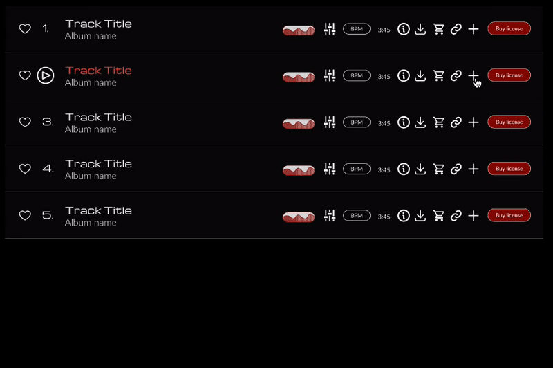
Album art dashboard

Track view dashboard

Internal track details dashboard
You B2Better Work
My design partner and I developed a semi-structured and remotely moderated test plan to map end user’s work flow for building a playlist. We asked 10 super users (internal & external) to walk us through their process for interpreting a brief, finding suitable tracks, and completing a playlist.
Internal & external users alike shared a similar workflow: Interpret brief > Taxonomical search > Visual assessment > Play Track > Add To/Create New Playlist > Save/Share.
Since briefs can range in complexity from “something short and snappy for a commercial” to “droning, ethereal strings for a romantic night scene in a sci-fi film” users spent nearly 20% of their overall task time walking us through how they decipher and interpret brief taxonomy before they even commit to executing a search. This meant that our users were entering a task exceedingly well prepared.
-
What Worked
Internal users loved how easy it was to collaborate and share playlists internally, and they felt the breadth & depth of data was unmatched by competitors.
External users raved about Anthem’s incredible customer support when they couldn’t find what they needed.

-
Biggest Complaints
Users couldn’t easily find track alt versions. Explicit searches rarely worked, the static playlist display overwhelmed the dash space.

-
Biggest Constraints
Explicit searches rarely returned matching results, as catalog contributors deliberately mistagged track metadata to manipulate search results. Hence, “The 6,000 Drakes Problem.”

“I Still Haven’t Found What I’m Looking For” (features that already exist on the platform)
External users had a whole different set of problems that didn’t come up when we ran through internal users’ workflows; they had no idea the problem-solving features they were asking for were already built in.
AI assisted search - Integrating an AI search tool to help cut through the overabundance of low-value search results dominated the conversation, which meant users were completely unaware of Source Audio’s integrated AI assistant, Artemis.
Playlist functionality - Users wondered why the playlist static playlist HUD took up so much space when there were no other ease-of-use measures like drag & drop track-adds in place (spoiler alert: users could drag & drop tracks to playlists).
Lyric lookup - A function of the secondary advanced search, users wanted to be able to look up lyrics and conduct “negative searches",” as in searching for what was not present in a track, like vocals or a particular instrument.
Dashboard Confessional
100% of users relied on visual cues to assess a track’s potential before ever pressing “play” because album artwork is designed to communicate the emotional through lines of it’s content.
Quantitative data like BPM, tempo, and time stamps were all sought out by users before they resorted to checking the wave form and playing the track. So while users valued having the wave display and track play at their discretion, they tended to interact with it as the last step in the process.
Despite the data, I couldn’t shake the feeling that I was sitting on a massive insight with the realization that so much of a user’s success is dependent on their access to visual representations of a piece of music’s emotional arc.
Research Recap
Solutions to some of the biggest user pain points already existed on Anthem’s platform, but an obstructive layout and lack of engagement-provoking signifiers meant users were missing these features entirely.
I couldn’t shake the feeling that I was sitting on a massive insight with the realization that so much of a user’s success is dependent on their access to visual representations of a piece of music’s emotional arc.
Moving into brainstorming design solutions, my biggest question became “how might we highlight existing dashboard features and visually communicate the emotional beats of audio content?”

“Re:Definition”
With the current state user task mapped thanks to our test participants, I built out a future state journey map to strategize around the known task pitfalls, and plan for positive touch point interactions.
Biggest ROI opportunities:
Building a helpful brand: Knowing how many users wanted AI help to dial in the search results, I saw a great opportunity to pair our visual hierarchy efforts with an update to the brand. We don’t just want to show users we have helpful tools, we want to walk them through the process of using them.
Ease up on the cognitive load: Since we know users value the data Anthem has on deck and the order in which they consistently move down the line to complete a task, I saw a huge opportunity to work toward a more modular approach that focused on building in more progressive disclosure.
Designing for autonomy: Despite internal & external users both having basically identical workflows, each brief might require some shakeups to the data set users sought first. For this reason, I wanted users to be able to approach their workspace like more of an admin dashboard, with the ability to toggle between the default views that might be most suitable to a single brief.
Signifiers, baby: Users were significantly burnt out by the process of needing to manually open playlists to add tracks, or open tracks to add to playlists, not realizing that the option to drag & drop tracks directly into the static HUD was there the whole time.
Having figured out what we wanted to focus on in the service model, I started to think about how I would envision these 3 objectively less-than-precise touch points into the more defined user flows our scope of work called for.
Consolidating 3 flows into one cohesive journey
Since the 3 primary flows that were most beneficial to users were integrated into one conversion funnel (search > results & secondary data review> add to playlist), I mapped out the primary actions into a micro & macro flow to ensure users could seamlessly enter and exit at several touch points without compromising the playlist experience.
Sort of like the “time is a flat circle” of user task flows.
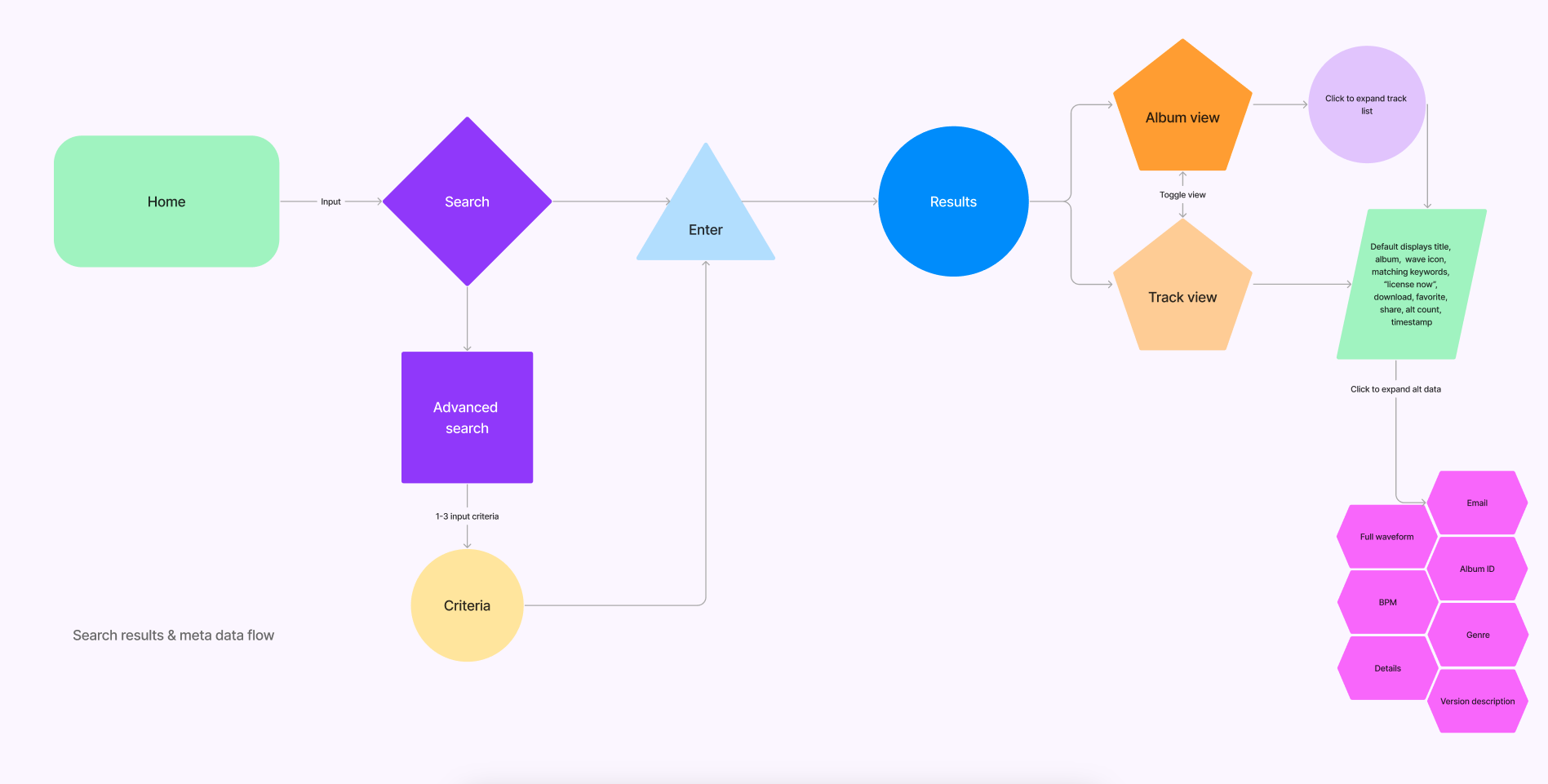
Macro flow: Map of the search/dash toggle/reveal metadata flow

Micro flow: New playlist/track add to playlist flow

Top-down architecture schema for micro & macro flows
-
Macro journey
Search to suitable track: Exploring how to build in modularity & progressive disclosure to ease up on the global cognitive load.
Pulled “advanced search” out of hiding (it was buried behind 2 sub-menus)
Toggle results between album & track view
Track metadata dropdown hierarchy
-
Micro flow
Add to playlist: Improving the “add to playlist” experience.
Built in direct add to all track view instances
Collapse static HUD in favor of a floating action button
Auto add all sub mixes so users don’t need to manually add all alt versions
Improve drag & drop signifiers
-
Architecture
Flow charts can be a little disorienting for stakeholders who don’t work closely with designers, so I reformatted my proposed flows into a more digestible top-down sitemap.
Instead of focusing on specific user actions to progress through the flow, presenting this view helped me communicate how the low would connect to the site at large.
“Sketches For My Sweetheart The User”
Task architecture was already super lean, with the essentials clocking in at 3-5 pages depending on where users entered from, but could easily expand into double digits depending on the amount of results they explored.
Sketches and wireframes served more as a retrofit to figure out how we wanted to visually prioritize data and update frequently reused content like album, track, and catalog displays, rather than how we wanted to steer users through a funnel.
Biggest changes from the live version
Playlist FAB: Users hated the static, immovable playlist HUD and felt that reclaiming that prime real estate would be the first step in decluttering the UI.
Toggle view: Having the option to view results by album, track, or label was exactly the sort of customizable interactions our users were asking for.
Collapsable metadata: BPM, tempo, genre, and stems/alt versions were consistently the most sought-after data.

Concept for toggle dashboard view and playlist FAB.

Concept for stacked track view and playlist FAB.

Playlist modal, "mixtape" add to playlist action, and wave form icon concepts.

Dashboard sketch overlay exploring dropdown & modular disclosure.

Concept for secondary track display from album-first view.

Desktop wireframes of our 3 integrated flows
Creating original icons to convey emotional through-lines
I couldn’t stop thinking back to the biggest surprising insight from my research rounds: users overwhelmingly rely on visual aids to weed out tracks they don’t think will fit their brief. And while the waveform display was an important part of feeling out the emotional arc of a track, that’s a lot of data to display, and it quickly made the UI feel overwhelmingly dense.
Not wanting to lose that key data point completely to the modular dropdown redesign, I started sketching shortened versions of the waveforms as placeholders in the track card layout to serve as a sort of “we’ll get to this later” solution that surprisingly ended up being exactly the secret ingredient that users wanted.
I presented concept sketches during one of our weekly stakeholder check-ins and, much to my surprise, there was an overwhelmingly positive reception to the bite-sized wave icon idea. Keen to point out how valuable visual cues are to the process, having this iconic snapshot afforded us the opportunity to tuck away the full wave in a sub-nav while subsequently elevating it’s placement impact.
So what does music look like?
Knowing the potential to shave down the time on task by an estimated 20-30% (per stakeholders) I got to work on development of branded icons to be reflected in the second round of wireframe iterations.
Since this isn’t a graphic design case study, I’m not going to drag you off the rails here. But what I will say is that I went through a few brainstorming sessions to explore some lo-fi icon designs that really just needed to be prominent, obvious, and legible for a potential mobile adaptation (internal tools are nearly exclusively desktop based).
Top considerations:
Legibility: Icons needed to be similar enough in structure to be immediately associated with the information it was replacing, but stripped-down enough to immediately convey the emotional arc of a track.
Versatility: Music follows boundless structures. Would a track in 4/4 need to look different than a track in 6/8? What does tempo look like? Am I overthinking this?
Reproducibility: With almost half a million tracks, there’s no way we’re generating this much content free-hand. I needed to come up with a design that was simple enough to potentially call in AI generated support to manage the catalog renders.
Stakeholders ended up gravitating toward this sharp red fill design for it’s boldness and ability to read more softly at lowered peaks, which I thought was a great catch. While all parties involved gravitated toward more sloping, organic curves, it just felt like curved waves would be hard to represent more intense or harsh compositions.


Second wireframe iterations
Four of our original testers were available to review our first round of wireframes and had some valuable feedback that we ended up developing for a second round of updates to our wireframes.
Updates included:
FAB to drawer: The playlist floating action button was considered a great first step that would be especially successful on mobile, but users still wanted something that was tucked away that they didn’t need to maneuver around. My solution to this was to include a drawer tab to reveal the playlist column from the left hand side.
AI toggle: First-run wireframes focused on amplifying the existing click-to-select AI icon to make the selection more obvious. External users who initially were unaware of the Artemis tool suggested reframing the search function to explicitly name the tool, and include a toggle on/off as to not rely solely on branding and contrast cues.
Suggested search: Nesting frequently searched for metrics as browse-by filters in a secondary nav schema in the new vertical global navigation was floated as a way to give users the option to start their search with the most important pieces of context.


UI & Visual Design
Anthem has a strong brand presence, but the platform could undeniably use an update. Ultimately, this project was a test run to develop a white label platform design that could be rolled out across it’s international subsidiary properties, so once we had the flow architecture and functionality decided, I began working closely with stakeholders to understand their long-haul content strategy & vision for the UI update.
I collaborated with Anthem’s internal front end development team and my agency design partner to establish a fresh, branded component guide that could be easily deployed and maintained by their internal design team.
To remain compliant with my NDA, these deliverables have been altered to remove proprietary information and any detailed micro-interactions.
Compartmentalizing the brand
Stakeholders were really into the idea of giving their platform the dark mode makeover, which I felt would beautifully enhance the sleek, organized approach we had in mind for content organization. Subtle signifiers pointed users to stacked alts & stems, which were a super high priority for them.
At this point I started to vibe less with the icon style. Once it was dropped into my stacked track components, it felt like it was standing in pretty stark opposition to the more retro pill shapes and slightly rounded corners that evoked the feeling of worn vinyl sleeves. The full-on fill also kind of missed the mark for me.


UI Update & prototype
I spent several weeks running weekly check-ins to debrief updates to the visual language & prototype. Getting past the first big visual milestone, we wanted to dive deeper into this chic, retro-futurist style that focused on 60’s inspired pill shapes, but paired it against the super clean Michroma for that touch of contemporary type.
We had played with enabling a light mode toggle in addition to our style guide, but ultimately stakeholders were dead set on dark mode for the new platform and didn’t want to spend to long on a secondary round of implementation.
“Is It Worth It? Let me work it.”
A successful launch
Developed using React and Tailwind CSS, a visually pared-down version of my dashboard (with most of the functionality we planned for) was deployed to test-run functionality & map any potential bugs before launching fresh on the new platform, which is currently still in development at the time of this writing.
Stakeholders & users alike were crazy about the potential for the new visual design, and felt the brand and UI update stayed authentic to the organizations’s roots while making it a standout in the B2B media licensing space, which isn’t generally on the cutting edge of visual design.
Bigger, more regular pitch decks
While we had several KPIs we wanted to improve, engagement with the playlist feature was the most important for what we were doing.
Engagement was measured by average playlist volume, and number of playlists saved (external users) and shared (internal users). Playlist volume was up an average of 8 tracks (or 25 minutes) and percentage of completed decks skyrocketed nearly 20%.
Since we made it so much easier for users to quickly parse visual data, the time it took to complete a playlist was down by anywhere from 10-45 minutes, depending on the complexity and requirements of the brief. That might seem like a huge variable, but placing 2 second sound design clips for a commercial and a 7 minute score for a feature film have radically different needs.
What I’m looking forward to
Due to the project constraints and platform limbo, there are still some cards on the table that I would love to get my hands on in the future which, for one reason or another, couldn’t be implemented this time around:
Enhanced AI search interactivity - during this scope of work stakeholders began to consider a replacement to their Artemis AI companion called AIMS. Since AIMS will require custom API design, we decided to shelf the Artemis signifiers and revisit it with the new platform.
Mobile platform - Anthem’s media licensing software is close enough to exclusively accessed on desktop that we may as well just say it is. Since users are typically accessing the catalog as part of a mastering/remixing workflow, mobile functionality is very limited, but users expressed wanting to see the Spotify-ification of Anthem for mobile.
My icon babies - This is arguably the biggest light-bulb moment of the project, and one users and stakeholders alike unanimously rejoiced in. But, while sheer brilliance on my part, implementing those assets with a catalog of nearly 500,000 and predominantly improperly-tagged assets was something we just didn’t have the infrastructure to apply this time around. But I am so hopeful that we can get it figured out for the new platform launch, because that was such an undisputed banger.
After 6 months of full-force sprints, I took this project from “we don’t like how this looks, and we want the new platform to be better” to “I put my thang down flip it & reverse it.”
While I had my agency design partner and our Creative Director/Project Manager in the weeklies, this was really my first Big Heavy Lift where the rest of the crew was mainly there to bounce ideas off of and lend a hand with the prototyping. I was running weekly stakeholder debriefs, giving presentations, and coordinating with Anthem’s dev team to make sure what we were gradually building toward could be seamlessly rolled out as a white label system across their 5 international subsidiaries.
This project was my baby, and I’m supremely proud.