

Designing Internal Order Entry Tools for Ares Sportswear
Ares Sportswear is a B2B/B2c custom apparel and sportswear retailer in Columbus, Ohio that predominantly serves academic sports teams with custom print, embroidery, and online team store hosting.
Over the course of eight weeks I collaborated with the Ares dev team, Operations Manager, and key users from the accounts & order processing team to design an order entry dashboard that would significantly reduce the time and effort required to process custom bulk orders.
-

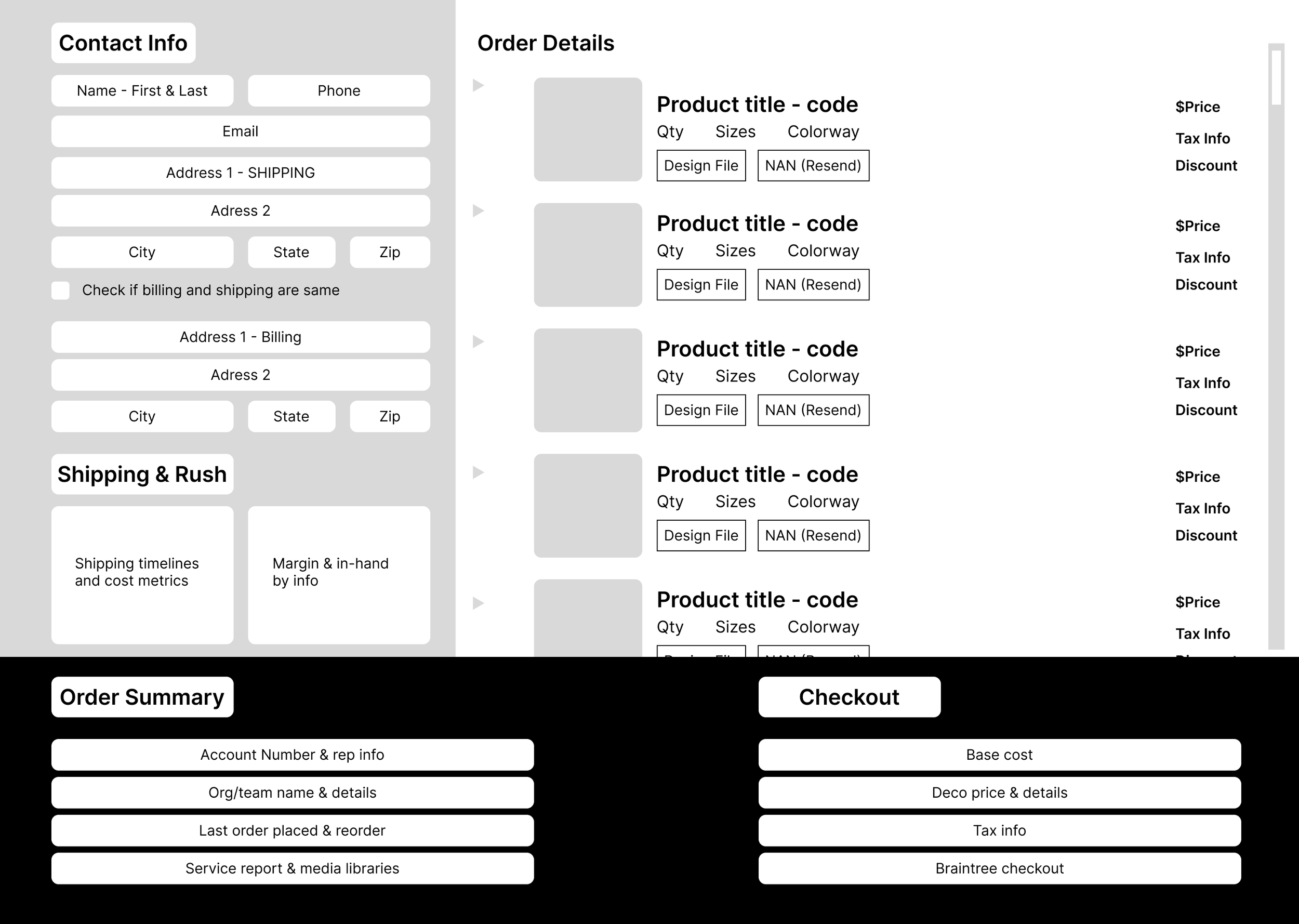
Before
- Cramped, sharp layout with no clear hierarchy
- No visual product reference
- Very low contrast and no signifiers or built in affordances
- Useless, unlinked assets (sticky notes in top right corner)
- It’s giving Windows 98
-

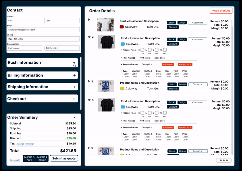
After
- Clean, compartmentalized layout that efficiently displays all necessary order info
- Appropriate real estate given to order content, complete with visual product representation
- Branded UI assets to communicate various order entry actions
- Nested, scrollable compartment hub for checkout, billing, and shipping info

The Context: Increased checkout conversions revealed internal stressors in the order entry process.
I joined the Ares Sportswear team to lead design initiatives for the client-facing experience of their platform, with a specific focus on resolving critical usability issues with their checkout funnel.
As incremental, low-effort/high-ROI updates to the checkout experience were rolled out, we saw associated increases in checkout conversions which revealed significant challenges in the process for Ares’ internal order entry team.
Account managers were struggling with:
No option for contact autofill resulted in a time consuming manual entry process.
Difficulty confirming order & item details - users needed to validate details on individual product pages.
Inefficient order edit processes, which frequently forced users to restart orders.
Ideating solutions: Establishing an MVP with stakeholders & users.
Users described the current order entry process as “half dashboard and half digital labyrinth.”
I ran a loosely structured discovery workshop with stakeholders and the accounts & operations teams to get map the entire order entry process, understand business objectives, and ask users for their highlights & pain points.
Everyone agreed that the order entry experience was ultimately designed by people who never needed to input an order, resulting in high-priority real estate being given to low-priority info (for this particular process) like profit margins & revenue insights.
While there was information presented that was valuable to stakeholders & operations leads, the people who needed to complete this task multiple times a day struggled to navigate around information that was secondary to them at best.
Our discovery workshop and process mapping revealed 3 distinct categories of information required for the end-to-end order entry task: information needed from the client, product details, and accounting information.

One of the most surprising insights to come out of this workshop was hearing from all parties involved that they felt the overall design was surprisingly close to what they needed. They felt the foundation for a more efficient, compartmentalized, singular dashboard was there, but they were frustrated by the illusion of modularity.
The most important information for processing orders was the detailed product overview, which provided information on sizes, print locations & methods, and art files. Relegated to a single line of text that users needed to scroll down to access additional product info, users needed to navigate to the individual product page to commit product edits. All things considered, it was a massive burden to process one order, even without the pressure of a rapidly expanding backlog.
Brainstorming a self-contained dashboard design from sketches to wireframes
Since the foundation for all the information we needed was present, and no glaring omissions or restructures were required, this part of the process was definitely more like a puzzle than a blueprint.
Focusing on economy of space, and giving ourselves the leeway to sub-contain additional pages (like a breadcrumb flow contained to a singular dashboard view) the Ares Operation Manager and reviewed the sketches and notes we had taken from our workshop to start refining them into a more fleshed out render of what we wanted to see in the wireframes.
Our plan for modularizing the dashboard focused on:
Self-contained product detail drop downs
Autofill option to streamline shipping & billing input
Way more real estate for products in the dashboard view
Product thumbnails to keep users from needing to navigate externally


Moving into high fidelity prototypes
A big part of the original scope of work I signed on for revolved around updating the visuals and brand presence for the platform at large, which was also undeniably needed for the internal tools as it turns out. We had come to a consensus between the dev team, accounts, and stakeholders on the content hierarchy and need to self-contain information where we could by keeping external reroutes to a bare minimum.
I ran 4 weekly sprints with our dev team, stakeholders, and key users to iterate & test as the design came together
Since the ROI for a better order entry dashboard was crucial for efficiently processing the elevated order volume we had coming in for the Spring sports seasons, I wanted everyone to be involved as we moved through the design phase to make sure the team was aligned through rollout.
In those 4 weeks, I delivered 4 iterated dashboard designs complete with updated style guidelines and documentation that clearly showcase a progression from early layout reworks to finishing touches.
-

Version 1.
Bifurcated design that featured collapsible shipping, billing, and client info in the left column, and a stacked display with scrollable product details and order summary.
-

Version 2.
The order summary section felt inefficient and a little expansive, so we decided to move that section into the left column, and include a contained breadcrumb for the new info.
-

Version 3.
Removal of the self-contained breadcrumb nav schema in the new order content block, since there was not enough content variety to justify. Instead, we added a scrollable function in the expandable content stack above order summary.
-

Version 4.
UI updates and additional buttons to account for some last minute “nice to haves” like individual custom art & sort CTAs that allowed users to tag multiple different products with unique art files within the platform’s file designer.

Branded UI assets
To resolve the visual accessibility and contrast issues that plagued the original version, and to keep true to the spirit of harmony across my original scope of work, I implemented the typography and brand palette updates I had been working on for the client-facing side of this project.
I chose Lato for the base-type style for the brand revamp due to it’s slimline, economical use of space that is still remarkably legible, and paired it with deeper blues & brand oranges to signify CTAs and interaction opportunities (the particulars are under NDA).


Democratizing the process
Since the dev team had been heavily involved with the ideation and design sprints, handoff was a breeze. The dashboard was built using an Angular framework with Tailwind CSS components, and was rolled out in 4 weeks to rave reviews.
The outcome:
My dashboard slashed order entry processing time by 40% by increasing visual cues by adding product thumbnails and color swatches, and keeping primary product adjustments like code lookup & size, quantity, and stock contained in a dropdown row.
While there are still some necessary external reroutes to accommodate more complex interactions like editing or re-positioning a design file’s print location, we were able to eliminate extraneous reroutes which, when coupled with our delightful visual redesign, has made a night & day difference in our user satisfaction.

Final thoughts
This was definitely the fastest turnaround I’ve ever had on a project (just 2 months from 0-1, so it felt more like a side quest) and there are a few things I learned that have been pretty invaluable for my approach.
While I might know more about the “right way” to design, the users have a deeper understanding of their practical needs than I ever will.
I was ready to die on the hill of “the checkout window should be the one that’s statically open” because it made sense to me that the last step in the process should be the one that is ready to go, so to speak. BUT it turns out that while, yes, that is the last step, users referenced the order summary most frequently, and didn’t want to need to keep expanding the sub-menu to access that information.
Not every design is going to be a whole great big ideological “thing.”
This was one of those projects where you have the basics, you know the needs, and it’s best for everyone on board to just jump in and get messy because the train’s already left the station and we gotta GO.
Would I have loved to spend weeks on research and development? Absolutely. I love a good couple back-to-back strategy sprints. But sometimes the team knows what they need (more or less) and it’s the designer’s role to make sure what gets delivered is elegant, intelligent, and right on time.